Project: Research Best Book/Magazine Cover [Shaikha.T]
1. What is the story?
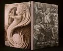
The cover tells the story of a supernatural transformation in an artist way. The illustration is more of a classic style than modern. It’s so surreal.
2. What are the strengths?
The neutral colors increased the mystery in the cover. The lines and the movement are similar to Art Neuvou, which positively support the story of transformation. Also the back of the book is strongly vibrant and it looks like it coming out to life. The font, on the other hand, is sans serif and simple; which is in contrast to the illustration.
3. What are the weaknesses? What can be improved?
—
..

1. What is the story?
The cover has a very futuristic and modern look and feel. It tells the story of a new discovery or a new era which go through a long process, a long journey. The back is a photo of footprints on the moon and some people at the very far which supports the previous story.
2. What are the strengths?
The colors are dark yet you see a sudden contrast; that tells us that the journey has its ups and down. The font is Futura, which is so geometric and modern. The alignment is simple and clear.
3. What are the weaknesses? What can be improved?
The bar code could be smaller and left aligned with the text.
..

1. What is the story?
You capture the story right away from the title and the warm image. The image shows the warmness of Africa. Also, it shows the end AND the beginning of a new day; that tells us about the journey in these wilds.
2. What are the strengths?
The Image is strongly suggests the process of a journey. The warm colors have an African feel to it. The font is sans serif that is clear and readable. The left alignment of the title is visually supporting the design and kind of creates a rhythm similar to the tree.
3. What are the weaknesses? What can be improved?
I think if the alignment of text at the back of the book was justified, it would be better.


Shaikha nice books. The first one is really eye-catching. It shows surrealism in a strong way. I like the typefaces in the last book. Simplicity is my favorite style I think and this sans serif is perfect..
Shaikha.. You have chosen books with strong visuals that are well representing the content, and supporting the story..
The 1st book is really so surreal, but I’m not sure about the color palette; it seems that the front cover is a bit cooler than the back one..
The 2nd book deserves nothing but praises..
In the 3rd book, I agree with you that the text alignment needs to be re-designed..
very strong visuals as Laila said..
and i agree with you about the alignment of the text on the back cover in the 3rd book ..
I so want to read the first book lol
I love first book A LOT! Such an interesting cover with strong visuals indeed. The two other books are unique and interesting too I think. Weaknesses as you mentioned are very rare, also Typefaces suits the whole look and feel in every book you chose, keep it up ^ ^
For the first one, i would really love to know the title of the book, but other than that i see that there is a rythem between the meaning of the story and the picture or illustration.
For the other books i like the pictures on them..
i wont go into details 😛
good work shaikha!!
I guess u chose the first book for your examples because your so into drawing :p
Nice books!